Summary
Liv.e Online is a user experience prototype designed to help users explore the positives and negatives of interacting with other people digitally. The player explores the character Liv's computer interface as she recovers from a bad day and tries to process it with the help of her new friends.
Tech Used
What I Did
- Conducted user research
- Created a wireframe to show user flow and concept
- Hosted user testing sessions
- Developed the Figma interactive prototype
Shoutout to Max Turnbull for the excellent tweets. Find them on Twitter @beakfriends
Intro
As part of my user experience class, we were tasked with taking a concept through ideation to a high fidelity prototype. Throughout the past year, I had watched many of my friends struggle due to the lack of in-person interaction and several of them were hesitant about trying to make connections digitally instead. I wanted to create a small vertical slice of a game that helped users explore the positives and negatives of online friendships through the safe lens of a fictional character. The project simulates a fictional online interface with facsimiles of real applications that are commonly used for online interactions.User Research
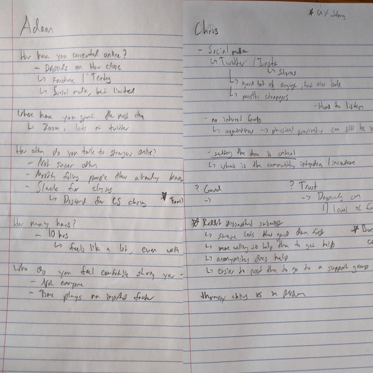
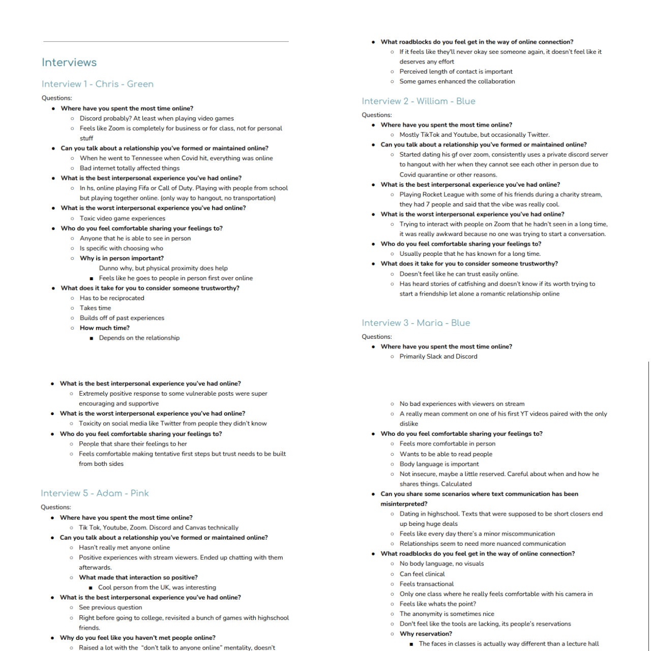
For user research, I did a series of interviews with friends and acquaintances. In order to get a good spread of data, I chose interviewees from different walks of life and experiences. Some people were heavily invested in online communities, while others barley participated in social media.
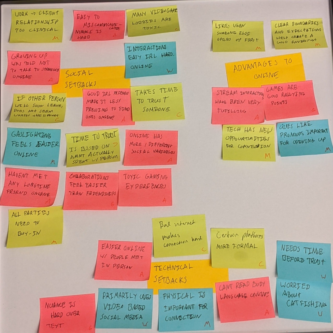
By processing my data and turning it into an affinity map, I found a few major things that my prototype would need to address. For example:
- Several interviewees expressed that the context of an interaction was important to them being vulnerable in an online space. A random group chat might stop them from sharing, but a forum dedicated to mental health was a significantly easier place to share.
- The inability for digital communication to truly rival in-person interactions in depth was a common theme. This feedback is what led to me implementing a video-chat scene in the prototype instead of text-only communication methods.
- There were a few unique positives to online interactions that I hadn't considered. The ability to meet strangers from around the world and the ability to easily set expectations through things like pronouns in your bio are two examples.
 |  |  |
Wireframing and User Flow
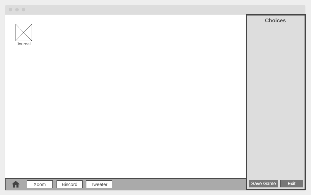
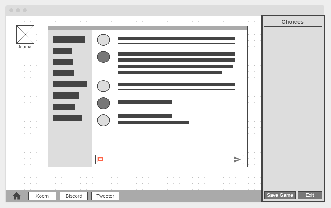
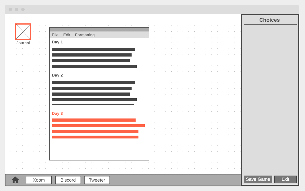
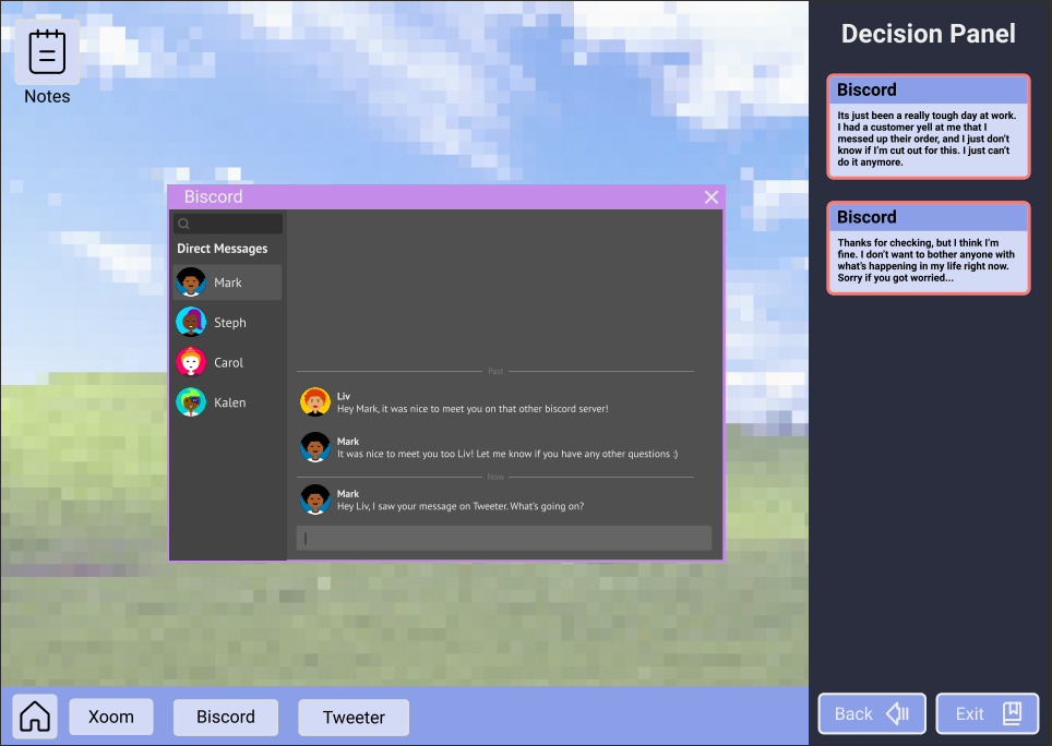
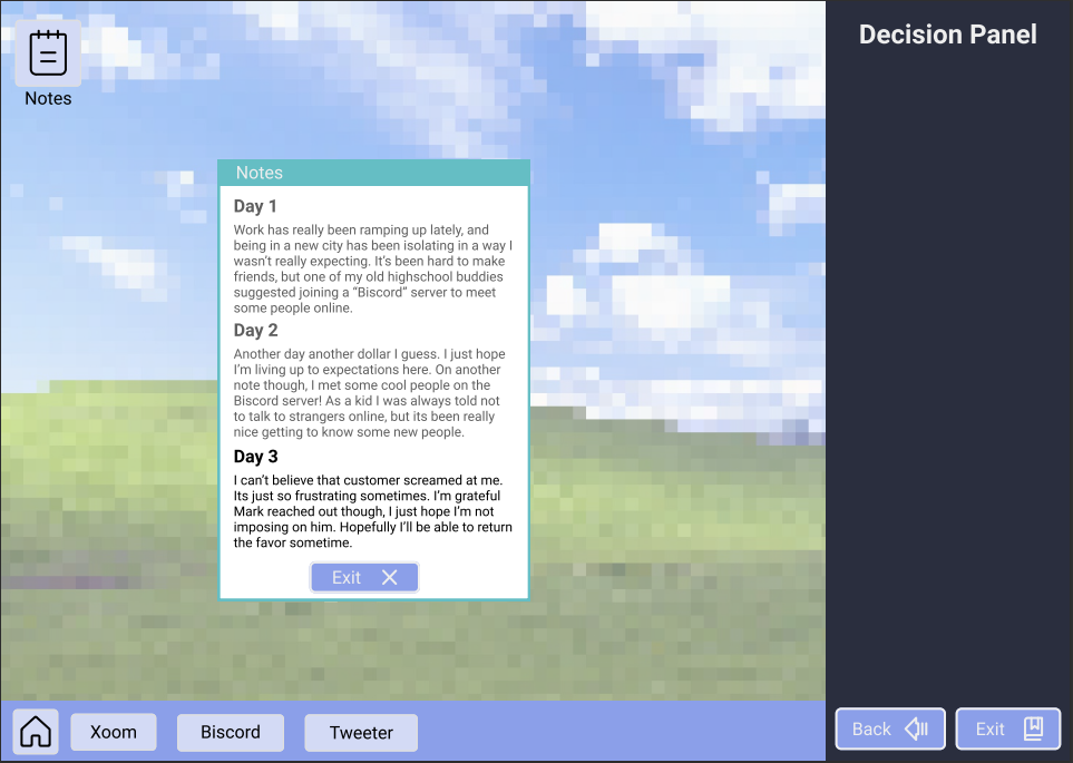
After conducting my user research, I decided on a basic user flow. The flow would take the player through three different online interactions, starting with a very broad interaction, like social media, and narrowing to a more personal digital interaction, like a video chat. Each interaction has a choice for the player to make, with one choice trending to be more vulnerable and the other a little more closed off.
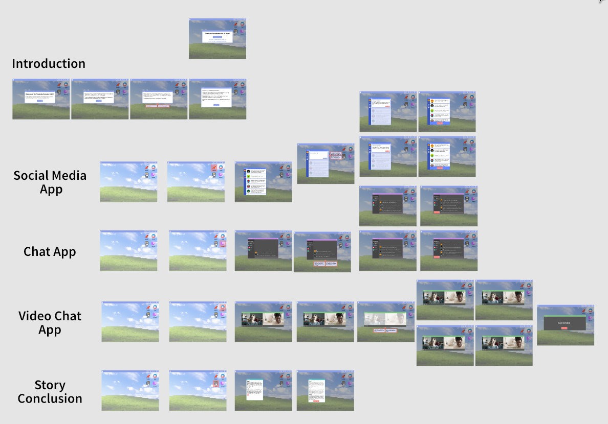
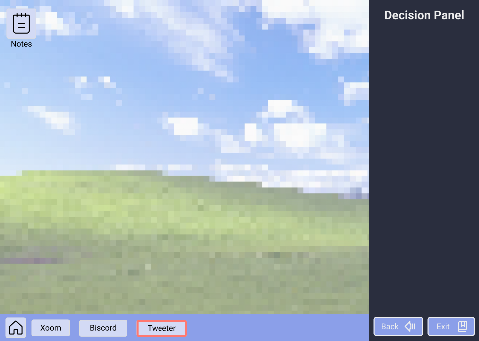
Through the wireframes, I started exploring what the fictional computer interface would look like. I took inspiration from graphic novels by having a section of the UI dedicated to making your decisions and choices, however I would eventually find this solution to be too clunky. I conducted playtesting with each iteration, and made changes like making the interactable elements more noticeable and adding an introduction for the game.
 |  |  |
 |  |  |
Final Prototype
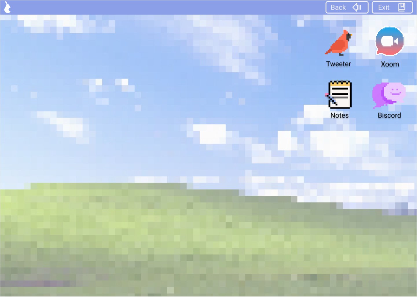
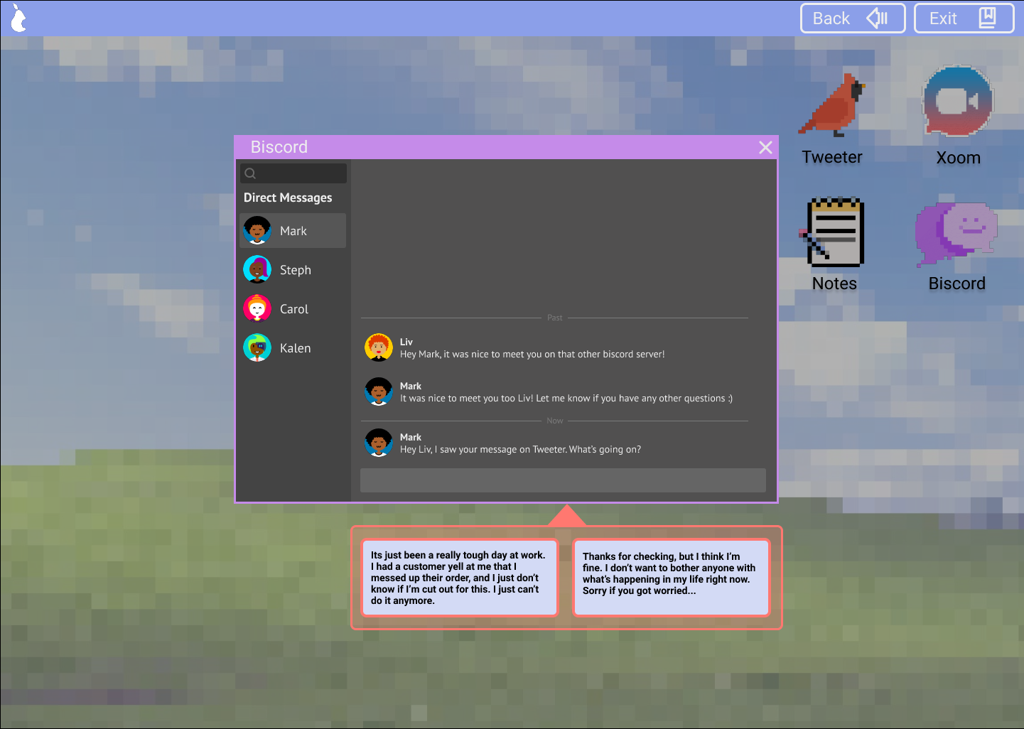
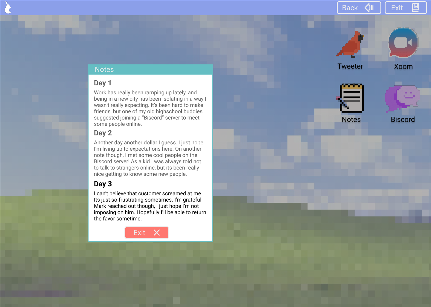
After lots of user testing, I arrived at the final prototype, which you can see and play below! A major change between the past iterations is the decision panel, which I removed due to the fact that it was only occasionally needed, and yet was constantly on screen. The prototype interactions were also streamlined to make it even clearer how to progress through it.
 |  |  |
Play the final prototype below!
Conclusion
At the end of the project, I am very satisfied with the final result. The entire project was such a significant learning experience. Each stage of development led to changes in the concept and a lot of UX process growth for myself.
For this concept, I would love to eventually develop it out into a full experience. A challenge I hadn't anticipated was just how hard it can be to write a visual-novel style game like this, with branching pathways and multiple endings. I would also appreciate being able to conduct more user interviews and testing, as there are a lot of different ways that people interact online and this experience could benefit from touching on more of them. Thank you for reading this breakdown, and I hope you enjoyed the project!
Also, shoutout to Max Turnbull for the excellent tweets. Find them on Twitter @beakfriends